
About the project
Micro Focus iWatch App Design
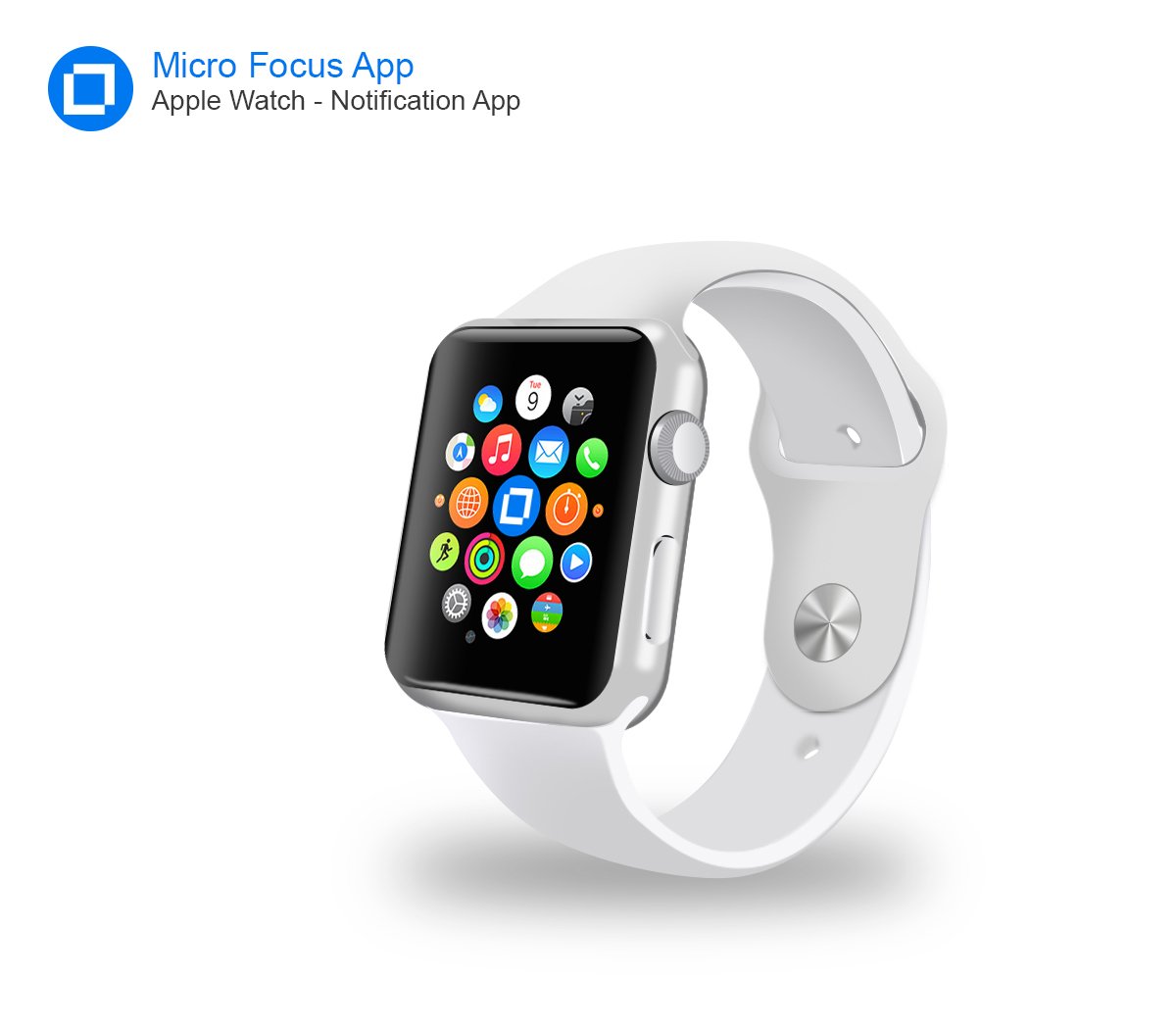
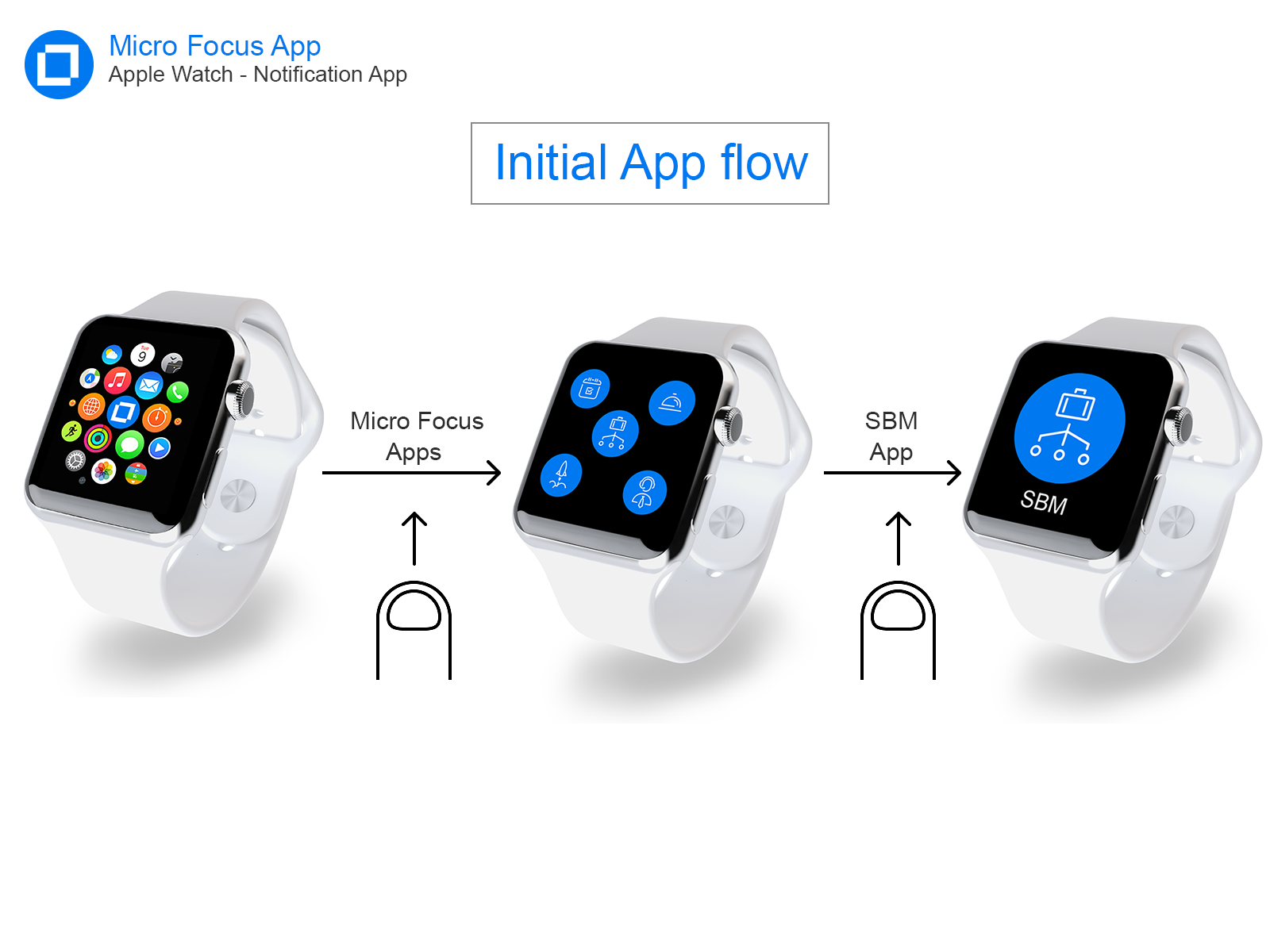
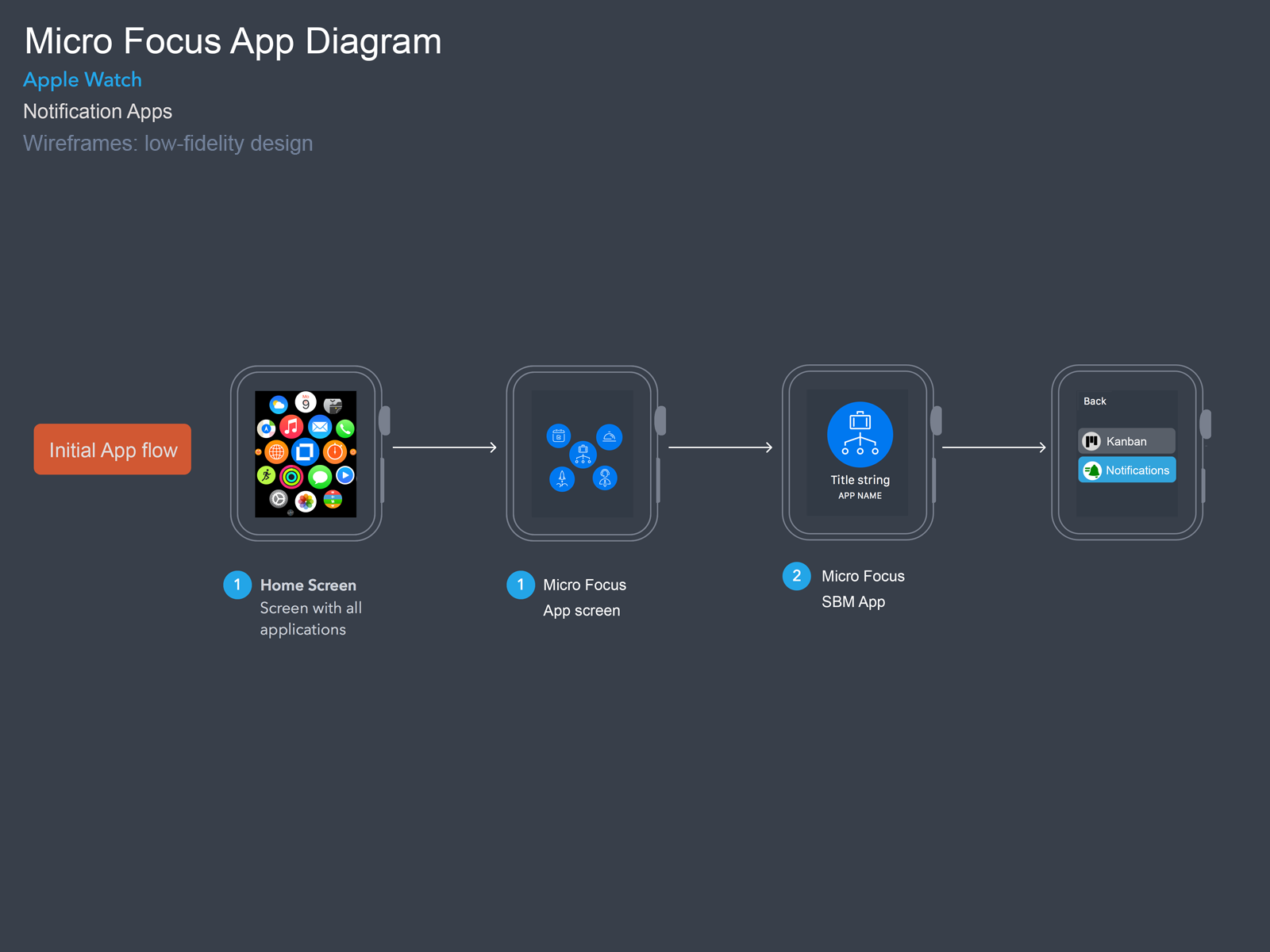
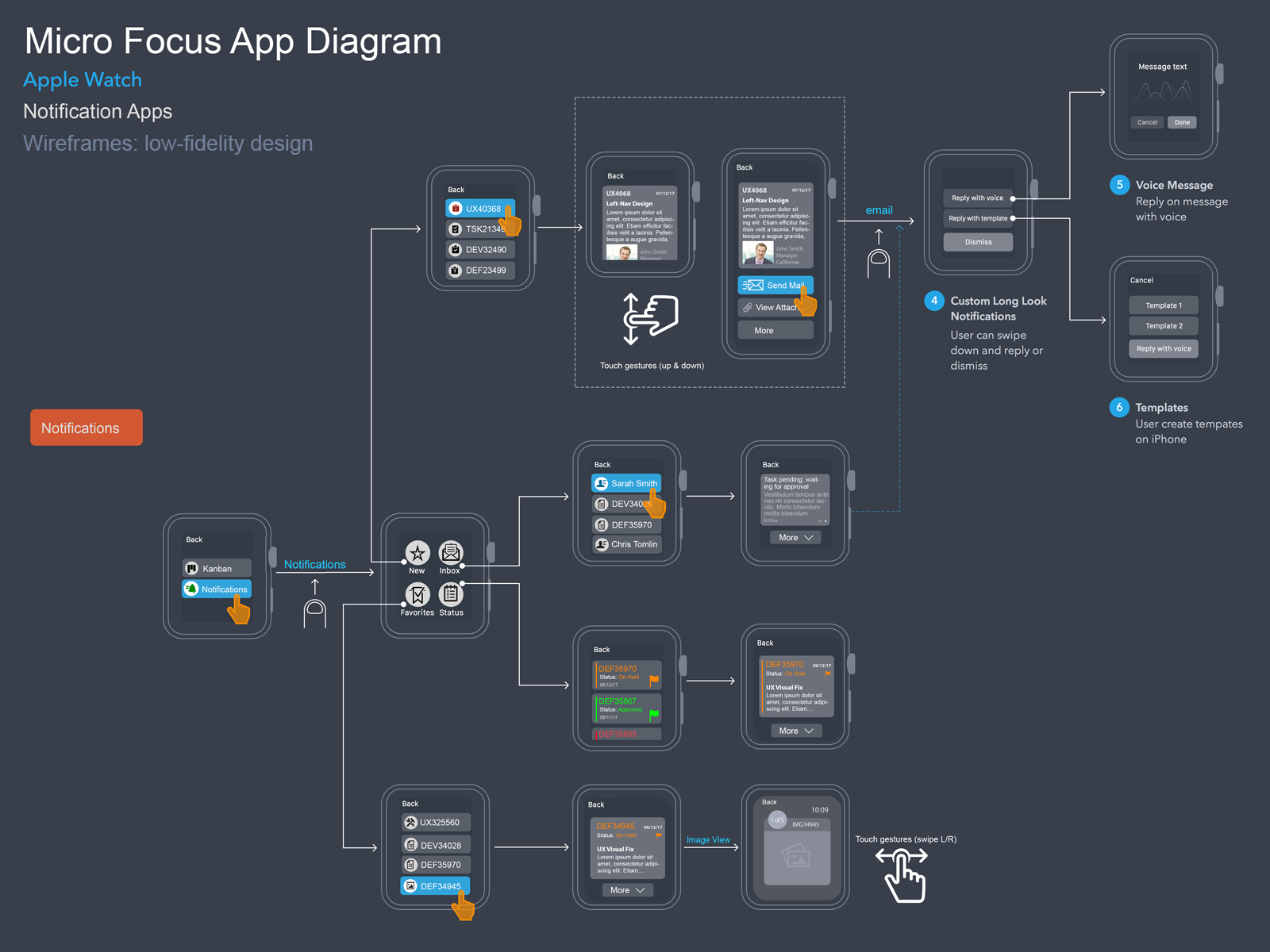
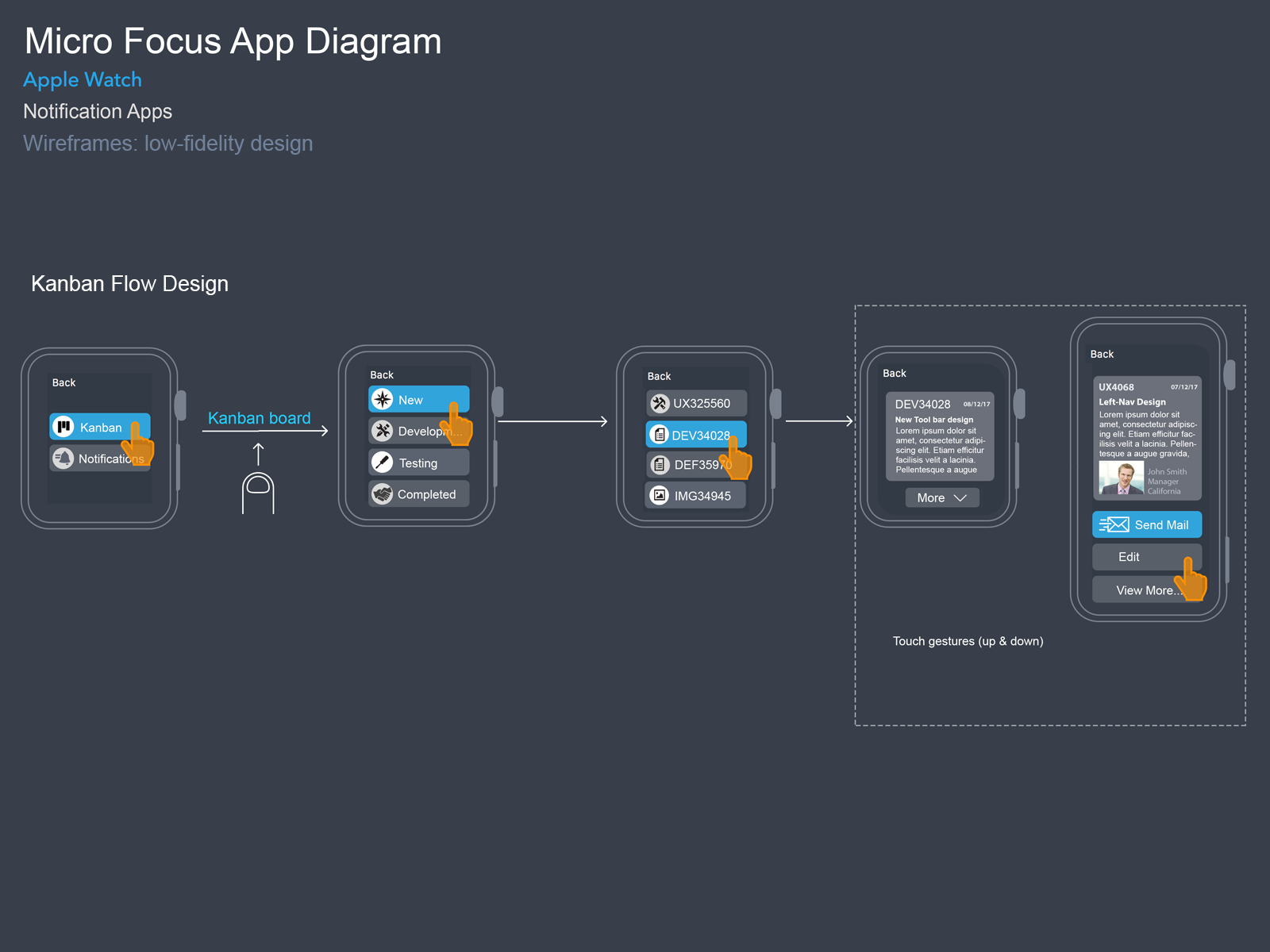
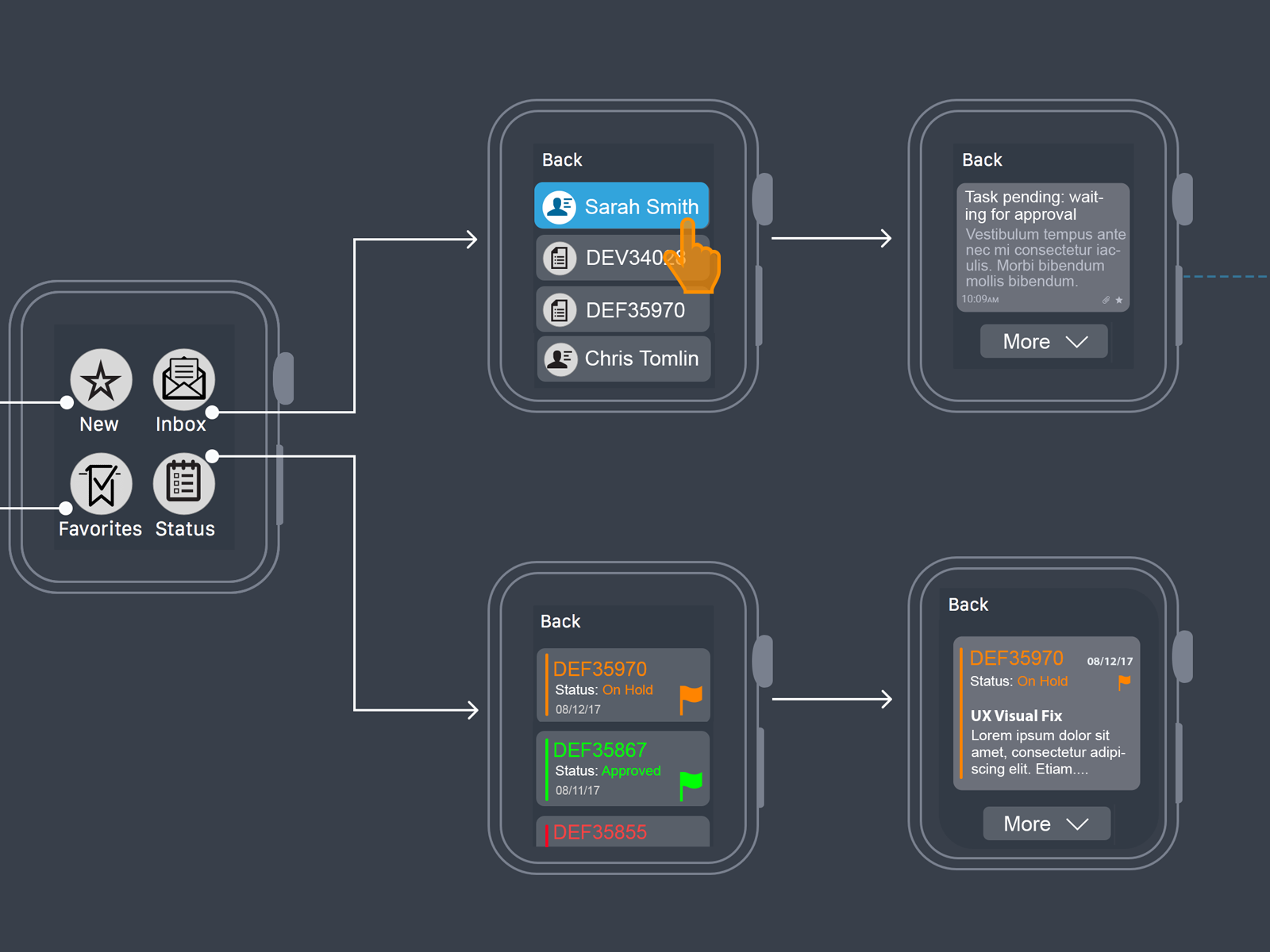
This is my exploration for “Smart Watch” interface design showing key features that allow user to view some of Serena’s products on iWatch, like task notification status. Low-fidelity design, as designers, I need to consider the size of the screen of the Apple Watch and understand that the design is completely different from the iPhone. This is so important since the screen size brings new gestures and new UI/UX considerations. Designing for the Apple Watch is completely different from designing for iOS.
| Client | Serena Software | Micro Focus |
| Project Proposal | Initial Design Concept |
| Platform: | iWatch |
| Software Tools | Figma, Sketch, Adobe Creative Suite |
| Created By | Pradeep Samuel |
The CHALLENGE
- Design for limited battery life.
- Design for a really tiny screen.
Designing for the Apple Watch is completely different from designing for iOS. I need to understand different aspects which make Apple Watch an amazing minicomputer and at the same time, an extension of the iPhone.
With a new device comes a thousand questions, opportunities and problems. At first glance, one of the issues we encounter is the proportion of the Apple Watch screen which comes in two sizes: 38mm (at 340×272 px) and 42mm (at 390×312 px). This means we don’t have a lot of room to play like in other devices such as the iPhone X and X Plus, and we have to adopt a new work philosophy around this device.
Design Principles
There are also some principles I need to consider the moment I start designing Wireframe apps.
Ways to Interact
Besides the familiar tapping and swipe gestures we use every day on our phones, the Apple Watch provides two new methods to interact: the Digital Crown and Force Touch.
Notifications
Apple Watch apps have two types of notifications: short-look and long-look interface. The user first receives a notification, which is the short-look interface. This notification is visible for a brief time, if the user wants to dismiss it, they can lower their wrist. If they want to see the more detailed information they can raise their wrist and tap on the short-look interface.
Legible
The user needs to understand at first glance what is the information you are displaying.
Summing up, as a designer I kept in mind that my design should constantly answer one question: What is the most important thing that the user will like to see at a brief glance? I Always consider these 4 qualities: legible, concise, timely and personal.